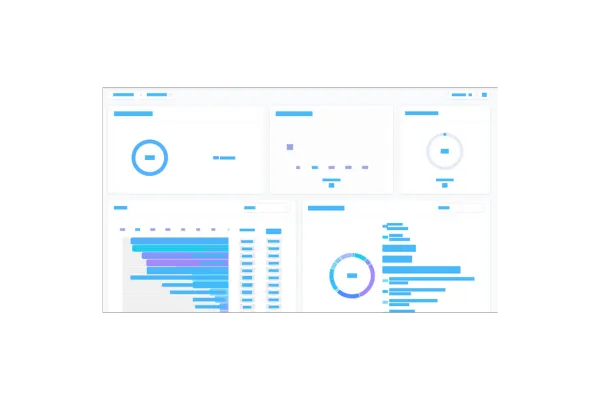
Dashboards: Comparison Percentage
We’re excited to introduce —Comparison Percentage—for your dashboard widgets! Now you can easily track and visualize how your data has evolved over time.
👀 What’s New?
Compare Performance: Instantly see how your metrics have improved or decreased by comparing data with a previous time period.
Quick Visual Cues: Green bubbles highlight improvements, while red bubbles show declines, giving you instant insights at a glance.
Custom & General Widgets: This feature works across all widget types—whether custom-built or predefined.
Granular Insights: Click on the comparison value to dive deeper and see detailed records from the selected time periods.
👷 How It Works:
Go to your dashboard and click the edit icon.
Select any widget from the list.
In the configure tab, go to Advanced Settings.
Select your comparison date range.
Hit Save!
⭐ Why it Matters:
Tracking performance just got easier! With the new Comparison Percentage feature, you can quickly see trends in your data and make informed decisions to boost your marketing and sales strategies. By comparing key metrics to previous periods, you’ll have the insights you need to optimize performance and grow your business.